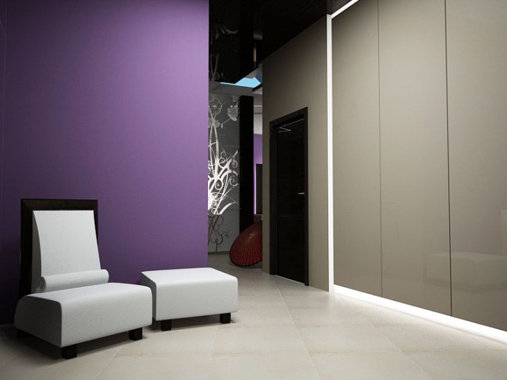
The choice of color scheme is one of the key moments in interior design.
A competent combination of shades allows you to create a harmonious space, emphasize the style of the room and give it a unique mood.
According to Yulia Tychino, an expert of the online publication "BelNovosti" in the field of design and interior, you should first decide on the basic color palette. To do this, you need to consider the purpose of the room, its size and the features of natural lighting.
For example, for a living room or a children's room, it is better to choose light, calm tones - beige, soft blue, mint. They create a feeling of spaciousness and encourage relaxation. Brighter shades - yellow, orange, green - are suitable for the kitchen.
After choosing the basic color scheme, you can move on to selecting shades for different areas and interior elements.

Here it is important to consider functional zoning in order to delimit the space and highlight the most important areas.
For example, for the living room walls it is better to choose a calm neutral shade - beige, light gray, pale blue. And for one of the walls you can use a brighter color to create an accent. Also, an active color can highlight the wall behind the sofa or the area under the TV.
For textiles, it is also worth choosing shades from the same color range. Brighter and more saturated tones are used for pillows, blankets, carpets. And for curtains, it is better to choose calm pastel colors to gently diffuse daylight.
Particular attention should be paid to the choice of shades for large pieces of furniture. The sofa, armchairs, tables set the overall color mood of the interior.
It is better to choose neutral natural colors for them - beige, light brown, gray. It is not advisable to use bright colors for furniture, as they can become boring over time.
However, you can add bright accents with the help of decor and small details.
Multi-colored pillows, vases, paintings will enliven the interior and create the desired color composition. Also, shades can be introduced with the help of functional elements - lamps, clocks, etc.
The main thing when choosing colors is to maintain overall harmony and balance. Too many bright, saturated tones can be tiring.
And too monotonous range will look boring. The ideal option is a combination of a neutral base with active color accents that highlight key areas and elements of space. Then the interior will look stylish and harmonious.


