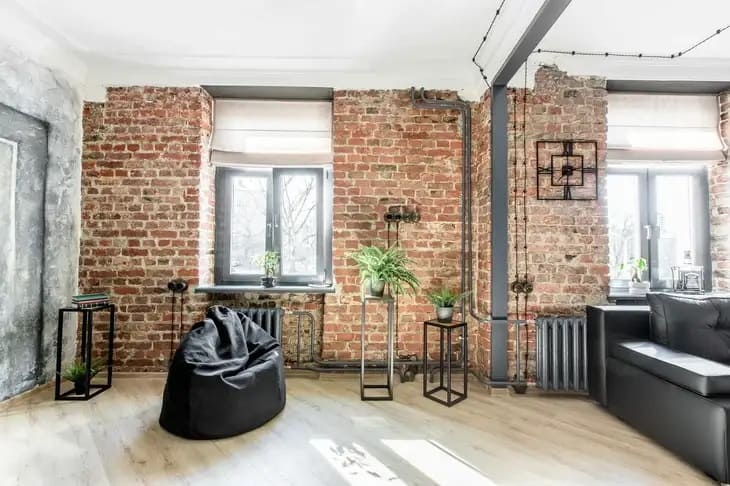
Do you dream of a large apartment, but currently live in a small one? Don't despair! With a few simple tricks, you can visually enlarge any living space.
You have been suffering from the cramped conditions of your one-room apartment for a long time. It seems to you that the walls are pressing in from all sides.
You want more space and light! But moving to a more spacious apartment is not in your plans yet.
In this article, we want to share with you the techniques that designers use. By applying these tips, you will turn your home into a cozy nest where you can finally breathe freely.
What magical techniques do designers use?
1. Color scheme
Bright and contrasting colors visually "eat up" the space. It is better to choose light tones - white, beige, gray, blue.

They reflect light and make the room more spacious. But to avoid the interior being boring, you can add a few dark accents.
For example, dark furniture or a painting.
The ratio of light and dark tones should be approximately 60% to 30%. Another 10% should be bright accent details in the form of pillows, vases, and books.
2. Playing on the contrast of the ceiling and walls
Painting the ceiling the same color as the walls visually lifts it up, making the room higher. But if you extend the ceiling color to the upper part of the wall, you can achieve the opposite effect - the ceiling seems lower.
Designers often use this technique to get rid of the "box" feeling and make the room more comfortable.
3. Mirrors
Slyly placed mirrors are a magical tool for designers. They help:
- visually enlarge the space by reflecting the room;
- hide interior flaws by distracting attention;
- create the illusion of an extra room by reflecting a window or doorway;
- fill the room with additional light through reflection.
The main thing is to correctly position the mirrors and think about what will be reflected in them. Then they will create real magic!
4. Light furniture
Heavy, massive furniture visually "presses" on the space. It is better to choose light glass or transparent tables, chairs and armchairs on legs, beds without massive bases.
You can use transformers - 2-in-1 furniture. For example, a coffee table that becomes a dining table when needed. Or a sofa with a folding mechanism for sleeping.
5. Minimum doors
The fewer doors, the better. Sliding doors or partitions save space. Give preference to glass structures - they visually increase the area due to the through space.
If possible, avoid unnecessary doors altogether. Open space always seems larger.
6. Smooth surfaces
The fewer details on the walls, floor and ceiling, the better. Smooth monochrome surfaces visually expand the space.
It is better to remove or minimize unnecessary irregularities, protrusions, baseboards, thresholds. A perfectly flat floor, walls and ceiling of the same shade will merge into a single plane, creating the illusion of greater volume.
7. Hidden storage
Open shelves with things visually "eat up" space. It is better to hide things in cabinets, niches, and drawers as much as possible. The cabinet doors can be covered with wallpaper to match the color of the wall, then they will practically "dissolve".
8. Vertical and horizontal lines
Vertical stripes or lines on wallpaper, curtains, and furniture visually lengthen the room and make it higher.
But horizontal lines, on the contrary, expand the space in width, but make it lower. This effect can be used according to the situation.
9. Minimalism in decor
Avoid unnecessary details in the interior. Every figurine, vase, frame distracts attention and takes up precious centimeters.
Remove unnecessary decorative elements, leave only the most necessary.
10. Smart work with light
Properly organized lighting works wonders.
- Use several levels of lighting - general ceiling lighting, local lighting above work areas, and decorative lighting.
- Give preference to spotlights, track systems, hidden lighting. Massive chandeliers visually "press" on the space.
- Fill the room with as even light as possible without sharp shadows. Dark corners eat up the footage.
- Use reflective surfaces to increase the spread of light throughout the room.
And the last important point - do not forget about the sensations! Even in a small apartment you can create an atmosphere of coziness, comfort and freedom. A fluffy carpet, upholstered furniture, pleasant to the touch fabrics, the scent of candles, favorite music - all this affects our perception of space.
Use this to feel truly comfortable at home, even in the tiniest apartment! Good luck in creating a cozy nest!


