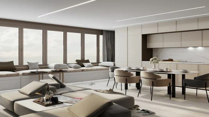
When decorating an apartment, it is worth remembering that housing should not only be beautiful, but also comfortable.
Expert of the online publication BelNovosti, designer Yulia Tychino, spoke about the most unsuccessful design decisions, as well as what needs to be done to avoid such mistakes.
Materials that imitate natural ones
Imitation, which always looks cheap, can only spoil the interior with its appearance. Instead of gluing wallpaper "under concrete" or installing a countertop "under marble", choose simple and self-sufficient materials that do not try to pass themselves off as something else.
Furniture arranged along the walls
Furniture items should "breathe", which is impossible if they are placed close to each other. To create a more interesting composition, move the interior items away from the walls and move them closer to the center.
Try to keep upholstered furniture items at least 1.2 m and no more than 2.5 m apart from each other.

Monochrome interior
Monochrome interiors really look beautiful, stylish and laconic. The catch is that without color accents the apartment will look dull and boring.
Furniture, textiles, wall, ceiling and floor decorations, all in the same color scheme, should not merge into one dull spot. If you want to avoid the dominance of several colors, consider using an unobtrusive print or bright decor.
Alternatively, make one wall an accent wall, hang curtains, or put pillows on the sofa in a matching color.
Earlier we revealed an easy way to update your bathroom interior.


