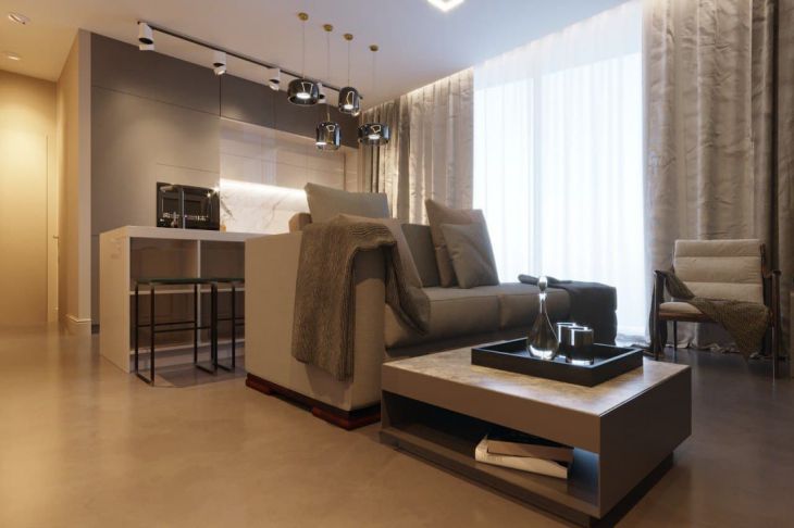
It's immediately obvious that they spared money: 5 things that make an apartment cheaper
There was a renovation, but you still couldn’t implement your plans so that the interior looked like a picture?
This happens when the homeowners have overlooked details that only make the space look cheaper. But what exactly should you pay attention to in such situations?
Batteries
Naturally, radiators in a classic style are not an interior decoration. But just one simple action will help make the room more stylish. To do this, you just need to paint the batteries in the color of the walls.
Plastic
This material is cheap and always looks bad, especially if it is used for window sills, baseboards, doors, and countertops. It looks especially bad with dark walls and floors.
A radical, but at the same time budget option: remove the trims, plaster the window sills and slopes, and then paint them in the color of the walls.

Color
Even the most expensive kitchen set will look cheap if it is acidic in color, diluted with outdated apron options (for example, photo printing or images of fruits on the wall, etc.).
Marketers have long discovered that people with decent incomes are more likely to prefer a restrained style.
Ceiling
A white matte ceiling is always a winning option. If it is stretched and glossy, it will visually make the space smaller, and the light it reflects will be irritating.
Thrifty little things
The mood of the interior can be set by things that at first glance do not seem important at all. For example, plastic for sockets and switches, which quickly gets dirty and turns yellow.
