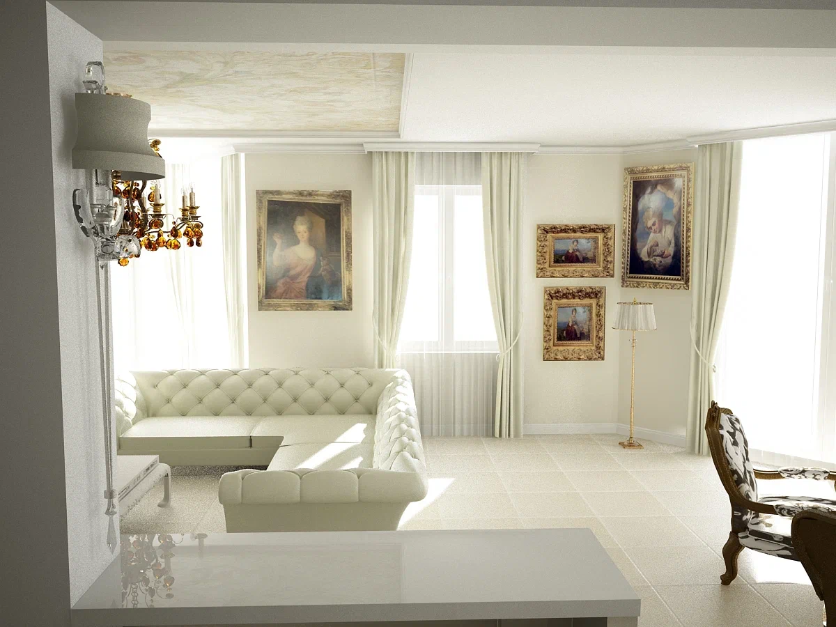
Interior mistakes that spoil the overall impression: designer's advice
Designers boldly state that the interior should be liked first and foremost by the residents themselves. But there are cases when comfort and convenience run counter to the concept of style.
Such interior mistakes spoil the overall impression, no matter what the owners of the house or apartment say in their defense.
Yulia Tychino, an expert of the online publication "BelNovosti" in the field of design and interior, told how not to make a mistake when doing renovations.
1. Hang the curtains correctly.
The cornice should be 15-20 cm wider than the window opening. It is hung above the opening at a height of up to 15 cm.
Curtains and tulle should be wider than the window, hang with loose folds and barely touch the floor.

2. Keep the proportions
This concerns furniture. There should be no large furniture in a small room. And if there is a TV on one wall and the other is empty, then some imbalance will arise.
3. Choose a carpet
You can zone the space with the help of a carpet. But the main thing is to place it correctly.
To make the room look cohesive, the front legs of the furniture should be placed on the carpet.
4. Choose a color
Solutions with contrasting colors win. To perfectly select colors and shades, use the color wheel.
5. Use light
Without proper lighting, all efforts will be in vain. It is necessary to provide several light sources - chandeliers, sconces, floor lamps, and so on.
Previously, we talked about how to create an interior for life , not for beauty.
