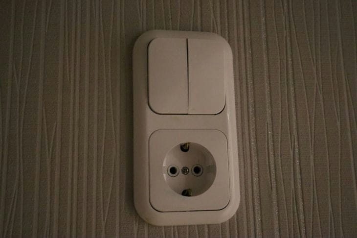
Hide or highlight: what color switches are best to choose
Even the smallest details, such as light switches, can make a big difference when creating an interior design.
They can be visible and visually interesting, or they can be camouflaged, almost hidden - it's up to you.
ADVICE.NEWS shared several techniques that interior designers typically use when choosing the color of these elements.
Contrast
It is often recommended to choose a light switch color that contrasts with the wall color to ensure visibility and ease of use.
For example, if your walls are light, choosing a darker color for the light switch can create a visual contrast that makes it more noticeable and accessible.

Camouflage
On the other hand, if you prefer a more cohesive and discreet look, you can choose a switch that matches the wall color.
This approach can help the switch blend in and become less noticeable, creating a clean, cohesive look.
Style and decor
If you have a specific theme or color scheme, choose a switch color that complements or matches it.
For example, in a room with predominantly warm tones, a light switch in a corresponding warm color, such as beige or brown, can enhance the overall aesthetic.
Subsequence
Some homeowners choose to maintain consistency throughout their decor by using the same color light switch in every room.
Neutral colors such as white, off-white or gray are usually used for this purpose.
Accessibility and visibility
If visibility and accessibility are important, especially for people with visual impairments or in poorly lit areas, it is recommended to choose a light switch color that contrasts significantly with the wall color.
