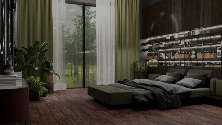
5 interior trends that have no place in a residential apartment: those who chase fashion will regret it later
Nowadays, there is more than enough advice on home improvement – design websites, glossy magazines and interior designer blogs are full of it.
With each season comes new trends, but the expert of the online publication BelNovosti, designer Yulia Tychino advises not to rush to follow such recommendations: first, it is worth weighing all the pros and cons, so as not to regret the decision made later.
Bright monochrome
Monochrome interiors look fascinating only in glossy pictures. Those who choose such a design for their home sign a long-term contract, according to which they undertake to buy items of only one color.
Besides, you can be sure that you will soon get tired of living in one color - especially if the choice falls on pink, lavender, lilac, blue and red.
Natural stone
Love for natural stone sometimes crosses all boundaries, and this material is used to cover almost the entire space. And if the stone finish on the wall and floor is the same color, the once cozy apartment will turn into a real mausoleum. Believe it: it is completely unsuitable for living.

White empty walls
In some rooms, a monochrome light interior with elements of minimalism looks conceptual and stylish. But over time, the emptiness and coldness of your apartment will begin to depress you. You will probably want to transform your walls with a shelf or several at once, photo frames and other little things - and goodbye, conceptuality!
Low cabinets
Don't settle for cabinets that are lower than your ceiling: they are real dust collectors, and if such furniture is in the kitchen, then, on top of everything, it also becomes a refuge for grease. Let the cabinets be up to the ceiling, and for small rooms - also in the same tone as the finish.
Chalkboard wall
You are unlikely to have the strength to maintain the beauty of a chalkboard wall every day. For this reason, in most apartments, this stylish detail eventually turns into an awkward black canvas.
